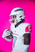
It’s funny, I was about to post something mighty similar b/c one of my boys, who’s also a uniform guy, brought something to my attention on another platform; the finish.
So we both have a keen eye for aesthetics, but he even more so b/c he worked for Mitchell & Ness & now works for Saks. So he brought to my attention how the new seam that Adidas is using interferes w/ the overlay of the numbers. Like some of the numbers are buckled, & u can see the seam through the numbers. The other thing he mentioned was the inconsistency of the collars; some collars appear snug while others appear to be saggy.
One of the things I said was these look good in the photo, but I need to see them on the field, & their functionality. Every time we’ve (the public) been introduced to Adidas’ “premium material” whether it was the strawberry patterns, the ribbed feature, or their version of dry fit (which these appear to be a mesh concept), during photo shoots or on a mannequins, they look awesome, but come game time & after a few equipment washes, they sag terribly around the collar areas.
The difference between Nike & Adidas is Adidas makes jerseys, Nike make performance uniforms. Nike is not above reproach b/c some on their design teams are pure garbage, but I’m talking strictly aesthetics & functionality. When Nike comes to a school, they literally do full body scans, and foot scans. They have cleats for QBs, RBs, Skills, Big Men w/ specific designs & measurements for individual players. When they set the uniforms, they’ve balanced tight fit + functionality.
I’ve seen this w/in O$U, UGA, UO, USC, Bama, UT, OKSt, Boise St, UCLA, & Colorado.