- Joined
- Dec 19, 2013
- Messages
- 32,485
ngl...them duck joints are pretty fire
Yeah, they flame on.
ngl...them duck joints are pretty fire
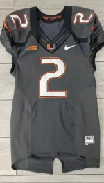
I feel like our smoke uniforms are our most underrated jerseys ever. We need to somehow do another version.
Lotta new uniforms dropped, particularly black, dark smoke, and anthracite.

Tennessee Unveils New 'Smokey Grey' CFB Uniforms in Video, Photos
Seven weeks away from the start of the 2024 season, the Tennessee Volunteers unveiled the newest iteration of their smokey grey jerseys. The updated look…bleacherreport.com

Boise State releases new uniforms using EA Sports College Football 25
Boise State collaborated with the highly-anticipated video game Tuesday to unveil its new blue, black and white jerseys for the 2024 season.www.ktvb.com

LOOK: Texas Tech football unveils new adidas uniforms
adidas is now the new apparel partner for Texas Tech athletics, and the football team unveiled its new uniforms in celebration.www.lubbockonline.com
https://x.com/BUFootball/status/1796196767370739740?ref_src=twsrc^tfw|twcamp^tweetembed|twterm^1796196767370739740|twgr^9033a80ae60bfbd34661a3a2bc65cab47344f2e9|twcon^s1_&ref_url=https://cdn.espn.com/core/standalone/webview?partial=articleappsrc=sclang=enregion=usplatform=iosconsent_mode=ccpaappearance=darkappversion=7.7.0appName=espnapp&consent_mode=ccpa

Indiana Football Shows Glimpse of New Uniforms For 2024 Season
BLOOMINGTON, Ind. – With a new head football coach apparently comes new uniforms. The official Indiana football account on Monday posted two pictures of the rewwww.si.com
https://x.com/wyo_football/status/1774880317024747854
https://x.com/TCUFootball/status/1802691917613809720
https://x.com/wvufootball/status/1786168796576698429/mediaviewer

Photo: Virginia Tech Unveils New Uniforms Ahead of 2024 CFB Season
Virginia Tech's new uniforms were officially released on Thursday. The school revealed a series of photos on social media that showcased the Hokies' new home…
**** right FIRE. These were my favorite because not only did they look cool, it just always made too much sense to me. Like I always felt we should have used these more in promotion with our name being the HURRICANES. GREY skies/bad weather ....some **** is about to get fvcked up lol. Idk man.I’ve screamed for YEARS about this. Our Smoke unis, which was the inspiration for Nike’s future smoke iterations, were absolutely fire.
Legitimately one of my favorite alternates & the material used was ahead of its time.
**** right FIRE. These were my favorite because not only did they look cool, it just always made too much sense to me. Like I always felt we should have used these more in promotion with our name being the HURRICANES. GREY skies/bad weather ....some **** is about to get fvcked up lol. Idk man.
100% agree w/ u.
I feel like our smoke uniforms are our most underrated jerseys ever. We need to somehow do another version.
And I hope that's sooner rather than later.We will when we finally go back to Nike.
We should have had a Smoke helmet, too. Would have really set it off.
He was at Oregon where they play in 12 different uniforms each season. I highly doubt one alternative is driving him up a wall.Hot take:
It's bad for our brand when all the recruits take their modeling photos during an OV in an alternate uniform that won't ever be worn again. I bet this black uniform nonsense drives Mario up the wall lol.
Agree with you blokes that Miami's alts should be gray instead of black.
Tennessee may have finally nailed their own gray Smokey Mountain unis
I don't think the lighting does it justice. If you look closely I think the outline of the numbers have green, green in the middle of the orange stripes on the helmet and on the sleeves.Trick or treat canes... I hate how there is no green involved.
I don't think the lighting does it justice. If you look closely I think the outline of the numbers have green, green in the middle of the orange stripes on the helmet and on the sleeves.
Come on man...other than the stripe issue you pointed out...those uniforms are excellent. Even the patch you're dogging is a nod to Tennessee's state flag, and since these are the "Volunteer State" uniforms, it makes sense.These are not good imo lol but not because the gray.
I think that white strip on helmet looks dumb because it's only on one side, and the shoulder patch is just ugly.
The reason the patch is there can be great. I just don’t like how that circular patch looks on the side of the shoulder like that. It could have been somewhere elseCome on man...other than the stripe issue you pointed out...those uniforms are excellent. Even the patch you're dogging is a nod to Tennessee's state flag, and since these are the "Volunteer State" uniforms, it makes sense.
I would be one of the last people to defend anything Tennessee since 1) it's where my ex-wife resides and 2) their fans are dumb as **** - but Nike got it right w/those uniforms.
NOIs this jersey in college football 25 ?