- Joined
- Dec 19, 2013
- Messages
- 33,403
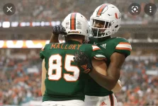
I'm surprised by how many fans have completely forgot about the uniforms from the 2003 to 2006 seasons. For me those were by far, the dopest gear the Hurricanes ever rocked. They screamed speed kills and explosive football, true hall marks of Miami tradition. The stitching literally put 'The U' on the players backs and offen that is all the oppositing defenders could see when they failed to run down our guys flying by them for the touchdown. They looked more modern then anything the players have wore since. From the letter font of the players names, the same style that was the class Miami font in our endzones, to that curved lettering style that was so uniquely Miami Hurricanes. **** even the font of the numbers was the best it has ever been with the curves on the 2, 3, 5, 6, 8, & 9s, and sharp edges of the 4 and 7. The pants were ice cold white that blended perfectly with the white of the helmets and white accents on the Jersey tops. Perfection of the flyest order.
P.S. Mario and/or the powers that be need to make sure going forward all home games whether in a new stadium or in HardRock get the **** endzones right. No more garbage miami dolphins lettering spelling out miami all weak and lame AF, no, it needs to be the Hurricanes Helmet with the Orange and Green U's on both the left and right sides of the endzone with that classic Miami font I mentioned earlier spelling out Miami in between.... see pics for clarification.
Bro, how dare u say such things. We’re just fine w/ saggy pants, stretched out U’s, faded oranges, deformed ironed on name plates, and in a stadium that uses The Dolphins home colors & lettering. All is fine.


