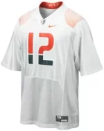
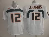
Couple things on Adidas deal

just get rid of those zelda gems on the jersey stitch and im good

This is the essence of my critique. Nike never sacrifices aesthetic for "technology" or tacky promotion of brand.
Adidas shamelessly puts their logo in the middle of the jersey, over the university name and logo. Ridiculous, and
I'm not too much of a homer to say it. I respect Nike for their creativity and brand ingenuity despite the business part of it.

Nike put the jordan logo on the side of the UNC helmet last week. I would be ****ed if anybody replaced the U with a basketball player, no matter how famous. Everybody company puts their logo over the school idenity, Nike especially.

University of North Carolina? I'm sure they were paying homage to an alum and generous billionaire booster. Think Chess, not checkers.

Come again.

I wasnt arguing that is a bad buisness decision and I am sure recruits like it. Regardless, It is "shameless" and a "tacky promotion of brand" whether you are playing chess, checkers, or UNO.

Nah...Apples and Oranges. The Jordan brand and UNC are uniquely intertwined; one could say the roots of his brand go back to Chapel Hill.
 
Advertisement
Are you guys seriously arguing about sneaker companies? One offered to pay us more and is therefore better. If Sketchers comes along and wants to outbid Adidas, then we take that. Who the fck cares which shoes you think are cooler or come in prettier colors? This is about cash and nothing else.
 

Anyone can take our classic look and refresh it. Only Adidas can use modern "technology" to make something look worse. At least Nike can take creative liberties and come up with a decent product. Why don't you post the fist unis from Adidas that look like pure trash? Nike was the originator with this branding. I'm sure had the contract been up this season we would have gotten a better deal. Sad how it went down.

We signed with Nike years after this classic look

Nike was the originator with program/university branding in their partnership with []_[]s. I know the look predated Nike to Russell. My greater point is, Nike represents innovation as a brand just like Miami, and Adidas lacks creativity or an understanding of our program.

:monkey-serious:

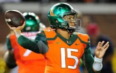
From this ugly ****

brad-kaaya-nike.webp

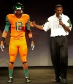
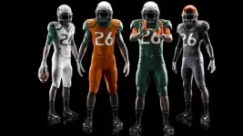
To this

new-miami-uniforms-vide.webp


I'd say one company doesn't understand the brand but you have the wrong company
 
Last edited:

Anyone can take our classic look and refresh it. Only Adidas can use modern "technology" to make something look worse. At least Nike can take creative liberties and come up with a decent product. Why don't you post the fist unis from Adidas that look like pure trash? Nike was the originator with this branding. I'm sure had the contract been up this season we would have gotten a better deal. Sad how it went down.

We signed with Nike years after this classic look

Nike was the originator with program/university branding in their partnership with []_[]s. I know the look predated Nike to Russell. My greater point is, Nike represents innovation as a brand just like Miami, and Adidas lacks creativity or an understanding of our program.

:monkey-serious:

From this ugly ****

View attachment 48425

To this

View attachment 48426


I'd say one company doesn't understand the brand but you have the wrong company


Read the thread, chiefy. These unis were done at Richt's behest, which included moving the logo from on top of the school and city name.


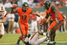
And, how about from this


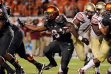
Su14_AT_NCAA_MIAMI_COMP_FRONT_NEW_hd_1600.webpduke-johnson-ncaa-football-florida-state-miami.webpmiami-hurricanes-duke-johnson-nike-uniforms-louisville-cardinals-labor-day-season-opener-2014.webpplayers reaction.webpplayer reaction2.webp


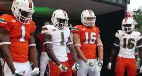
To this ugly ****


umunigreen.webp


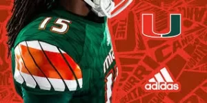
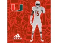
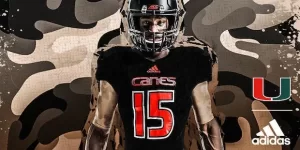
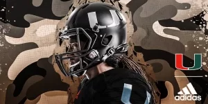
Adidas base pant.webpAdidas Green base uni.webpAdidas ice uni.webpMiami_adidasFooball_Military-Appreciation_Front.webpadidas black helmet.webp
 
Last edited:
Advertisement
Anyone can take our classic look and refresh it. Only Adidas can use modern "technology" to make something look worse. At least Nike can take creative liberties and come up with a decent product. Why don't you post the fist unis from Adidas that look like pure trash? Nike was the originator with this branding. I'm sure had the contract been up this season we would have gotten a better deal. Sad how it went down.

We signed with Nike years after this classic look

Nike was the originator with program/university branding in their partnership with []_[]s. I know the look predated Nike to Russell. My greater point is, Nike represents innovation as a brand just like Miami, and Adidas lacks creativity or an understanding of our program.

:monkey-serious:

From this ugly ****

View attachment 48425

To this

View attachment 48426


I'd say one company doesn't understand the brand but you have the wrong company

Read the thread, chiefy. These unis were done at Richt's behest, which included moving the logo from on top of the school and city name.

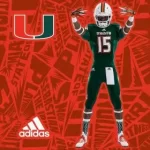
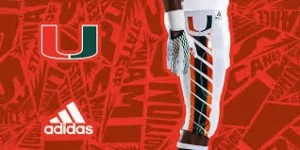
If you leave it up to the creative geniuses at Adidas this is what you get.


View attachment 48433View attachment 48434View attachment 48435View attachment 48436

They fixed it.... we looked more like a Miami team uniforms wise then I've seen since the early 2000 uniforms. What the **** are you still tripping for ?
 
Anyone can take our classic look and refresh it. Only Adidas can use modern "technology" to make something look worse. At least Nike can take creative liberties and come up with a decent product. Why don't you post the fist unis from Adidas that look like pure trash? Nike was the originator with this branding. I'm sure had the contract been up this season we would have gotten a better deal. Sad how it went down.

We signed with Nike years after this classic look

Nike was the originator with program/university branding in their partnership with []_[]s. I know the look predated Nike to Russell. My greater point is, Nike represents innovation as a brand just like Miami, and Adidas lacks creativity or an understanding of our program.

:monkey-serious:

From this ugly ****

View attachment 48425

To this

View attachment 48426


I'd say one company doesn't understand the brand but you have the wrong company


Read the thread, chiefy. These unis were done at Richt's behest, which included moving the logo from on top of the school and city name.


And, how about from this


View attachment 48437View attachment 48439View attachment 48440View attachment 48441View attachment 48443


To this ugly ****


View attachment 48438


View attachment 48433View attachment 48434View attachment 48435View attachment 48436View attachment 48442

The 1st year sucked no doubt but Adidas is a company who apparently cares about the brand because the next year they fixed everything. They are awesome and best we have had in 15+ years. Nike was giving us ugly **** for over a decade

I'm not sure why you are highlighting those Nike uniforms. Those were dog**** for the most part.
 
[MENTION=14105]Mahoney-Pearson[/MENTION] cares more about some faceless company from Oregon, than he does about the canes.

Grow the fūck up, man. You defend this company that tried to ***** us, with more passion than anything having to do with the real canes.

It's truly pathetic.
 
Majority of young people wear adidas now anyways. Nike is a shell of its former self
 
Advertisement
Majority of young people wear adidas now anyways. Nike is a shell of its former self

I'm more of a Jordan/ Nike guy but adidas definitely is on the come up. They got the most popolar shoe out right now in the yeezy 350's. Adidas is definitely making moves
 
Advertisement
Majority of young people wear adidas now anyways. Nike is a shell of its former self

I'm more of a Jordan/ Nike guy but adidas definitely is on the come up. They got the most popolar shoe out right now in the yeezy 350's. Adidas is definitely making moves

Makes sense as Adidas doesn't look good on fat people.

What?

He meant pfag but your dumbass missed it as usual.
 
We signed with Nike years after this classic look

Nike was the originator with program/university branding in their partnership with []_[]s. I know the look predated Nike to Russell. My greater point is, Nike represents innovation as a brand just like Miami, and Adidas lacks creativity or an understanding of our program.

:monkey-serious:

From this ugly ****

View attachment 48425

To this

View attachment 48426


I'd say one company doesn't understand the brand but you have the wrong company


Read the thread, chiefy. These unis were done at Richt's behest, which included moving the logo from on top of the school and city name.


And, how about from this


View attachment 48437View attachment 48439View attachment 48440View attachment 48441View attachment 48443


To this ugly ****


View attachment 48438


View attachment 48433View attachment 48434View attachment 48435View attachment 48436View attachment 48442

The 1st year sucked no doubt but Adidas is a company who apparently cares about the brand because the next year they fixed everything. They are awesome and best we have had in 15+ years. Nike was giving us ugly **** for over a decade

I'm not sure why you are highlighting those Nike uniforms. Those were dog**** for the most part.

Richt made them fix the unis and that's my point. You all should give them credit for responsiveness, yes, but Adidas need(ed) a lot of interdiction when Nike had better creative intuition going with an off-retro look.

This is to say nothing about my support for one over the other because I don't come to the defense of brands like that unless I own stock. It's not that serious for me and I think the new unis look great, FWIW.

What's happening here are the easily-triggered feeble-minded stans of the site are looking for anything to be buthurt and b**ch about, because that's just what they do.

I'm highlighting the unis you call dog**** (1) in reply, and (2)for the sake of showing the Adidas work was worse than dog****, because there's not a fan on this site (including you) who would choose Adidas year 1 gear over the last Nike unis.
 
Last edited:
Advertisement
Nike was the originator with program/university branding in their partnership with []_[]s. I know the look predated Nike to Russell. My greater point is, Nike represents innovation as a brand just like Miami, and Adidas lacks creativity or an understanding of our program.

:monkey-serious:

From this ugly ****

View attachment 48425

To this

View attachment 48426


I'd say one company doesn't understand the brand but you have the wrong company


Read the thread, chiefy. These unis were done at Richt's behest, which included moving the logo from on top of the school and city name.


And, how about from this


View attachment 48437View attachment 48439View attachment 48440View attachment 48441View attachment 48443


To this ugly ****


View attachment 48438


View attachment 48433View attachment 48434View attachment 48435View attachment 48436View attachment 48442

The 1st year sucked no doubt but Adidas is a company who apparently cares about the brand because the next year they fixed everything. They are awesome and best we have had in 15+ years. Nike was giving us ugly **** for over a decade

I'm not sure why you are highlighting those Nike uniforms. Those were dog**** for the most part.

Richt made them fix the unis and that's my point. You all should give them credit for responsiveness, yes, but Adidas need(ed) a lot of interdiction when Nike had better creative intuition going with an off-retro look.

This is to say nothing about my support for one over the other because I don't come to the defense of brands like that unless I own stock. It's not that serious for me and I think the new unis look great, FWIW.

What's happening here are the easily-triggered feeble-minded stans of on the site are looking for anything to be buthurt and b**ch about, because that's just what they do.

I'm highlighting the unis you call dog**** (1) in reply, and (2)for the sake of showing the Adidas work was worse than dog****, because there's not a fan on this site (including you) who would choose Adidas year 1 gear over the last Nike unis.

CMR had nothing to do with the uniform change. Last year, he confirmed the uniform change was already decided previously. He also said he was a big fan of the uniforms. Try again.... better yet, take this L and move on.
 
I liked both brands' alternate jerseys: the Nike Smoke jersey with the orange helmet, and the Adidas Black Military Appreciation jersey with the black helmet. Beside that, neither Adidas nor Nike gave us anything to write home about in their first efforts off the blocks.

But the real difference is Adidas has made UM a priority, whereas Nike did not. Adidas has given UM more money, more gear, and more involvement in the creative process (as seen by the quick changes made to the uniforms, which are great again). At this point in the deal, we are definitely much better off with Adidas than we were with Nike.
 
Lots of silly people trashing adidas because they prefer the swoosh. Ridiculous.

Let's be honest, Nike came in with a trend-setting deal originally, but when it comes to the uniform, we already had a classic look due to our own creation (helmet) or prior uniform companies (Russell with the classic 1980s uniforms).

People tend to forget...

--Nike struggled to get the right shades of orange and green
--The redesigned "Ibis" (or "clam") was horrible, and was done only so Nike could cut its royalty payments to John "Sebastian" Routh, who drew the most popular version of Sebastian (corncob pipe) that we know and love
--While Nike came up with a couple of great designs, they also had some horrendous misfires, and they kept those misfires for years before making changes
--Nike came NOWHERE CLOSE to the $$$ offer that adidas made, ignoring our groundbreaking legacy together to chase other programs with lesser history

And, yes, adidas has made some mistakes, but they are quick to acknowledge and make changes, something Nike would never do.

I would like to see adidas produce an authentic jersey with sewn-on numbers instead of silk-screened numbers, and it would be nice to see what they might do with throwbacks, if produced at a similar high-quality.

they actually released those a few weeks ago. i bought mine on release day and it's amazing. it fits almost a size smaller than the screened ones though.

http://www.adidas.com/us/hurricanes-mens-football-jersey/CA5151.html
 
If anyone is honestly upset with everything Adidas has given us thus far, they are an idiot. We got way more money than with Nike. And the unifos are amazing right now. Like seriously if you are finding a way to complain about our current uniforms your just a hatin little bytch plain and simple. And of course we are going to have a few special uniforms every once in a while, that's what happens when your important to a company.

the first year and a half of adidas uni's was pretty rough, but the money certainly made it easier to accept.
 
Advertisement
Back
Top